Hey heyyy! So I’ve been planning this post forever because I get these questions a LOT. They are serious, important, life-changing questions like…how high should I hang my light fixture?
See, this is DEEP people.
So I compiled a bunch of frequently asked size/distance questions and my advice. These aren’t rules cause I don’t believe there should be any rules when it comes to decorating your own house. But they are guidelines to help you make things look and feel “right.”
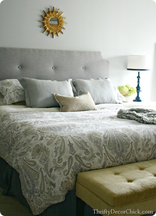
First up, the headboard. I’m asked a lot about the size of our DIY headboard:

The height depends on your room, the ceiling height and the look you’re going for too. Some want an exaggerated, high headboard for the drama of it, which can totally work.
Now, let’s talk lights. First up – the size of the light. The general rule is adding up the dimensions of your room and that will determine the width of your light. So if your room is 15 by 15 feet, you’ll want your light fixture to be at least 30 inches in diameter.
Of course there are exceptions to that too – we have an open kitchen/family room so I went larger in there, even though the nook isn’t big at all:
I err on bigger instead of smaller for my lights, at least now. I’ve had smaller lights in that spot and they never felt right to me. This one feels right, but it’s also a fairly “light” fixture – not heavy feeling so that helps it from looking massive.
Also, if you have super high ceilings you can throw those dimensions out the window and go pretty big.
Where you hang you light matters too. The general advice is 30 to 36 inches above your table. I’ve also read a standard 66 inches from the floor to the bottom of the light, but I like to base it off of the table, not the floor.
Here’s the thing – I hung our dining room fixture (this room looks completely different now) at 36 inches above the table:
And I find that WAY too high. It has always looked awkward to me. I prefer a lower light. The light above our kitchen table is only about 25 inches above the table and I love it so much more at that height.
Again, on this one I say err on too low instead of too high. Not too low that you can’t see each other across the table of course, but low enough that it kind of grounds the space.
And when you hang a light or have someone do it for you, make sure to leave enough wiring up inside the ceiling so you can adjust it later. I’ve cut so many too short and can’t change the length or move them around. (You can add wiring but I prefer not to do that.)
The experts -- I read it in a Pottery Barn catalog ;) – say bathroom sconces should be at about 66 inches off the floor, but again, I kind of buck that advice. In our powder room I wanted to clear the wall treatment so I went higher, about 77 inches:
Because here’s the thing – at 66 inches off the ground you’re lighting the sink and the floor, not you. I wanted the lights to shine down on our faces, so I went higher and I really like it:
I did the same in the basement bathroom – you want to work off where the mirror will comfortably go:
Those are about 75 inches from the floor. This is one that you’d have to play around with to see what works for your family.
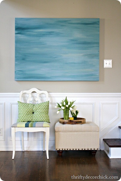
Hanging art is such a personal preference too. Overall the advice is to hang the middle of the art at eye level:
The thing is, I’m 5’9” so my eye level is a few inches taller than most of my friends. ;) So again, it’s a personal thing. We have nine foot ceilings in most of the house so I feel like I can go a bit higher with the art. Otherwise there’s an awkward amount of space above it that I don’t care for.
Of course gallery walls throw all that out the window. :) On our basement wall I went all the way to the ceiling and filled the whole wall:
Again – it’s your house. Do what you want. :)
Finally, the rugs. OH, the RUGS. They are hard, right? I think so. At a dining table the advice is to make sure the chairs can be pulled out and stay on the rug. So the rug should be big enough that the chairs don’t fall off when someone is sitting at it.
For other rooms, there should be a good foot, preferably more, around the room where you can see the floor. Otherwise it looks like wall-to-wall carpeting, you know? Unless that’s what you’re going for!
But at least in our family room, I’ve learned over the years that a bigger rug is better:
I thought it would make the space feel cramped and it did the exact opposite. I don’t know what it is about a smaller rug, but at least in here it made the room feel much smaller than it was.
The general “rule” is that at least the front parts of the furniture should sit on the rug, but I’ve heard many say all of the furniture should comfortably sit on it. I tend to go for the former. As long as some of the furniture is on it I’m good.
Ugh, so many rules. This is why I say take this all with a grain of salt. Most of the professional advice has not worked for me in this house. It’s been ten years of trial and error to figure out what works and I’m always tweaking as you know.
Do you ever wonder about these? Any I didn’t cover?
P.S. I’m making progress on the mud room – and patiently waiting on one big part of the room to come together. I hope to show you this week!


No comments:
Post a Comment