It took me a whole year to figure out the paint colors for the Bub’s big boy room (are you tired of hearing about it yet??). I wanted something that was a bit more mature but still fun…and I was determined to NOT do primary colors.
Why? I have no idea. I guess because it was predictable? I’ve mentioned before how hard it is to create a unique space for a boy no matter what the age. His apple green and cream nursery was my answer to breaking away from the blue for a baby boy.
But a couple weeks ago, when the new room came together in my head – it had blue walls. Not just blue walls, but deep, navy blue walls. Navy blue walls that screamed, “A cute little boy lives here!!” All of the sudden all I could think about was BLUE.
Can I tell you – I’ve never liked blue. Not one bit. It’s just never been me. But lately, it’s really growing on me. There are three rooms in our house that may have tones of blue on the walls in the near future.
Well, make that two more -- one already does. This is why you never, ever, ever, NEVER say never. :)
Ever:
That light switch is crooked! Gah. That’s gonna drive me batty.
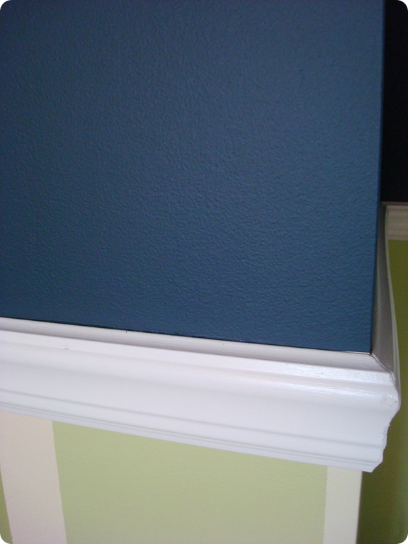
I have realized something about myself lately – I adore contrast. Like, big fat wanna marry it if I wasn’t married already LURVE contrast. This blue with the white woodwork is turning out exactly how I saw it in my head:
And look at this blue with the apple green!:
Ignore my scraggly paint lines on the green wall, and just pay attention to that beautiful color combo! I love it. I’ve already gone with other colors for the room, but seeing that green with the blue makes me want to keep the splash of apple in here.
For those of you who are freaking out that’s it’s going to be too dark – I promise you it is not and will not. The area under the chair rail will be bright and I have a few other tricks up my sleeve – you’ll just have to wait to see. ;)
I used the Behr Ultra paint for this project – from what Paint Guy told me, it’s the only version of Behr that is low VOC. Although at times I still felt like it was a bit stinky – I’ve used low VOC once before and it didn’t smell “painty” at all – this one did at times.
The Ultra also has the primer in it as well – which turned out super handy, cause I was going to have to prime over the little bunnies, lambs and words on the walls. Because I was covering a light cream with a darker, saturated color, I did have to do two coats, which I normally don’t do.
No hint of the bunnies peeking through, so it works!:
I can “cut in” with the best of ‘em when I’m going up and down on a wall…but horizontally I fail miserably. So I had to tape off all of the chair rail and crown molding, and the result is giving me the itchies:
I may just recaulk everything, instead of trying to get the lines matched up. Dark paint is not forgiving!
I used a scrubbable flat paint, which I’ve used before and am quite happy with. It looks GREAT on the walls. As I’ve mentioned, I usually use an eggshell finish on our walls because it’s a great compromise between a glossy sheen (which shows all of the wall’s imperfections) and a true flat (which is just asking for hives, especially in high traffic areas).
You can’t see the roller marks with this paint either, which I LURVE. Overall, I’m really happy with it! And it was only $30 a gallon – I thought it would be much more than that. I’m a pleased peep with Behr paint:

And guess what? I didn’t cry when I painted over those cute bunnies. Not even a sniffle. :) I am so excited with how the room is coming along, I am having a blast starting the transformation. I’ll show you more later this week!
P.S. My friend AnNicole wrote here about the Behr Premium Plus Ultra paint as well!


No comments:
Post a Comment